underboyleheating
-
Posts
12,539 -
Joined
-
Last visited
-
Days Won
107
Content Type
Profiles
Forums
Events
Everything posted by underboyleheating
-
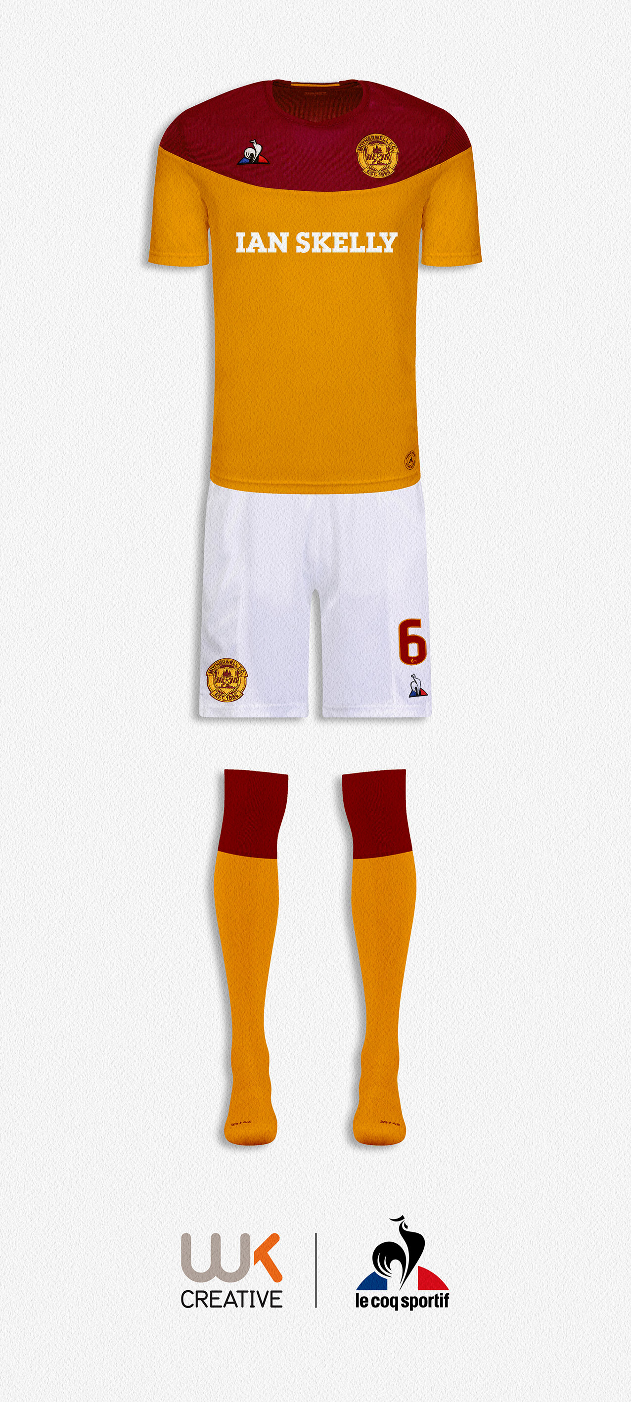
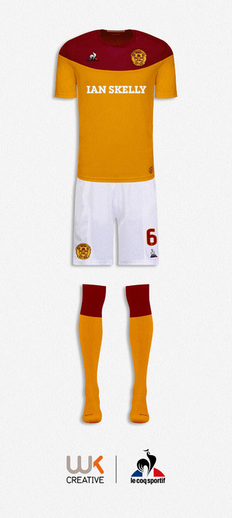
Motherwell’s first ever C&A shirt was mainly claret with a bold amber yolk. However, as our shirt evolved the amber soon became the dominant shade. Le Coq Sportif have a yolk design as part of their current range and I utilised it for my ‘reverse’ take on our first C&A shirt. I’ve always loved Le Coq Sportif sportswear, although they have never really made a big inroads in the UK team wear market.
-
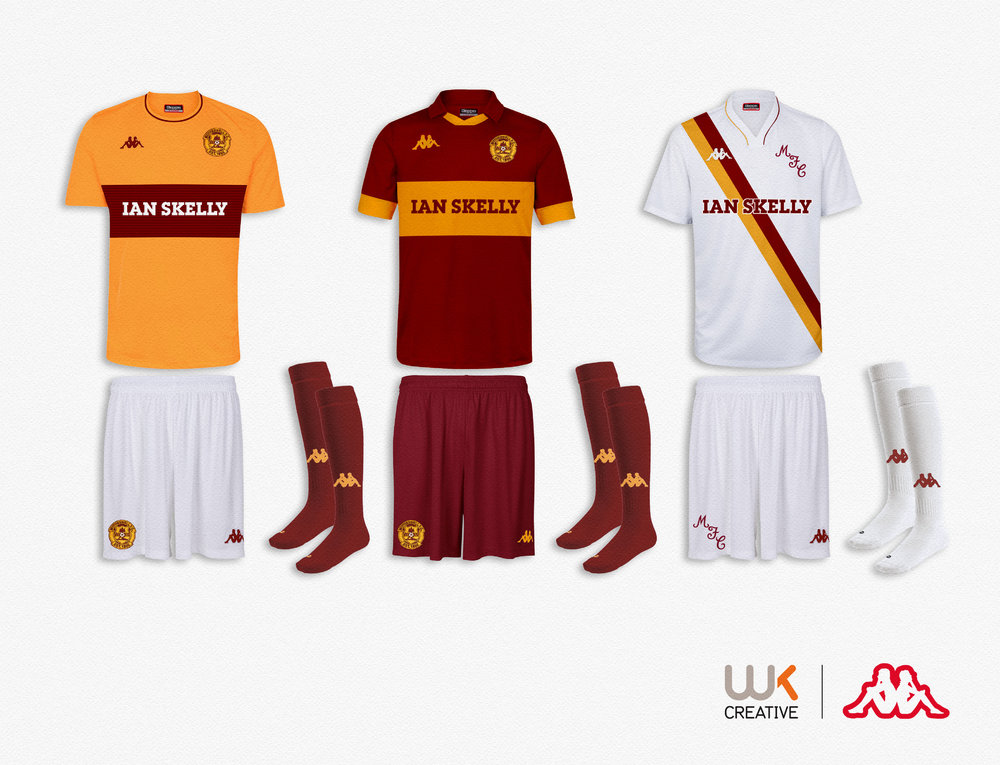
Kappa are probably better known as a sports fashion brand. However, they still produce pro team wear for a few clubs. I’ve mocked up three current templates with additional sublimation that I though looked pretty smart in claret & amber.
-
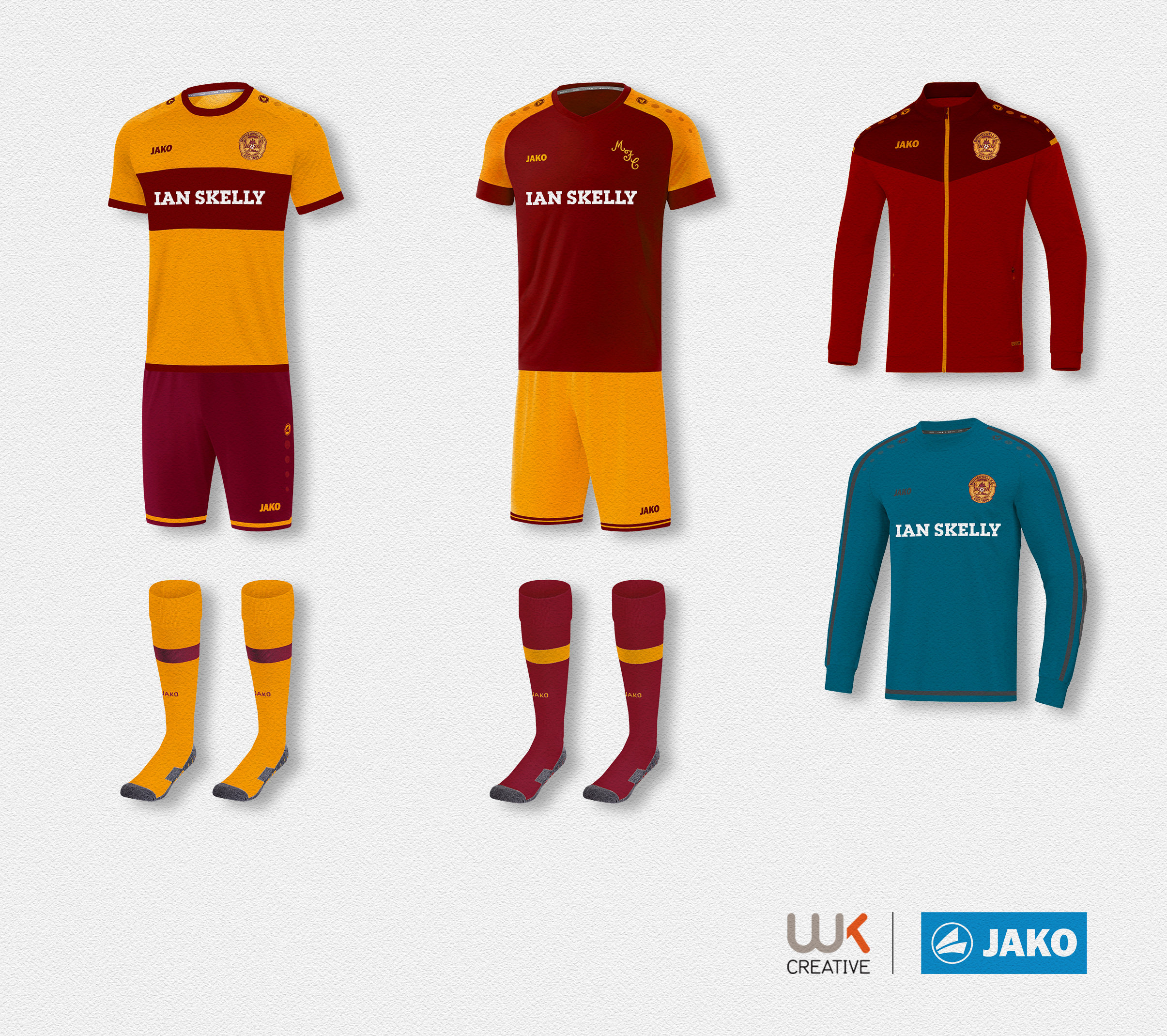
First time I’ve looked at Jako team wear. The bold chest band ‘Boca’ template would make a decent, classic Motherwell home shirt. They have some nice team wear templates on their website and a few of them would look good in claret and amber.

-
I did a reworked version drawn from a photo of the steelworks. I gave it to a fan group for their flag.
-
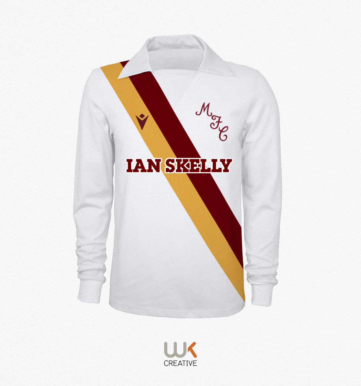
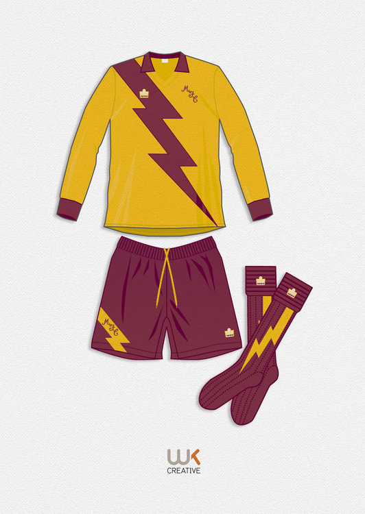
The new Admiral ‘fan designed’ kit wasn’t universally liked so we reverted back to the previous Admiral kit. The new kit was produced by Admiral after a competition was launched by then manager Roger Hynd. I was 14 and my lightening bolt sash design (happily?) didn’t make the cut. Coincidently AS Roma adopted a lightening bolt sash last season, perhaps I was a visionary? This was my entry, drawn from memory...
-
with me and the girl from Clapham.
-
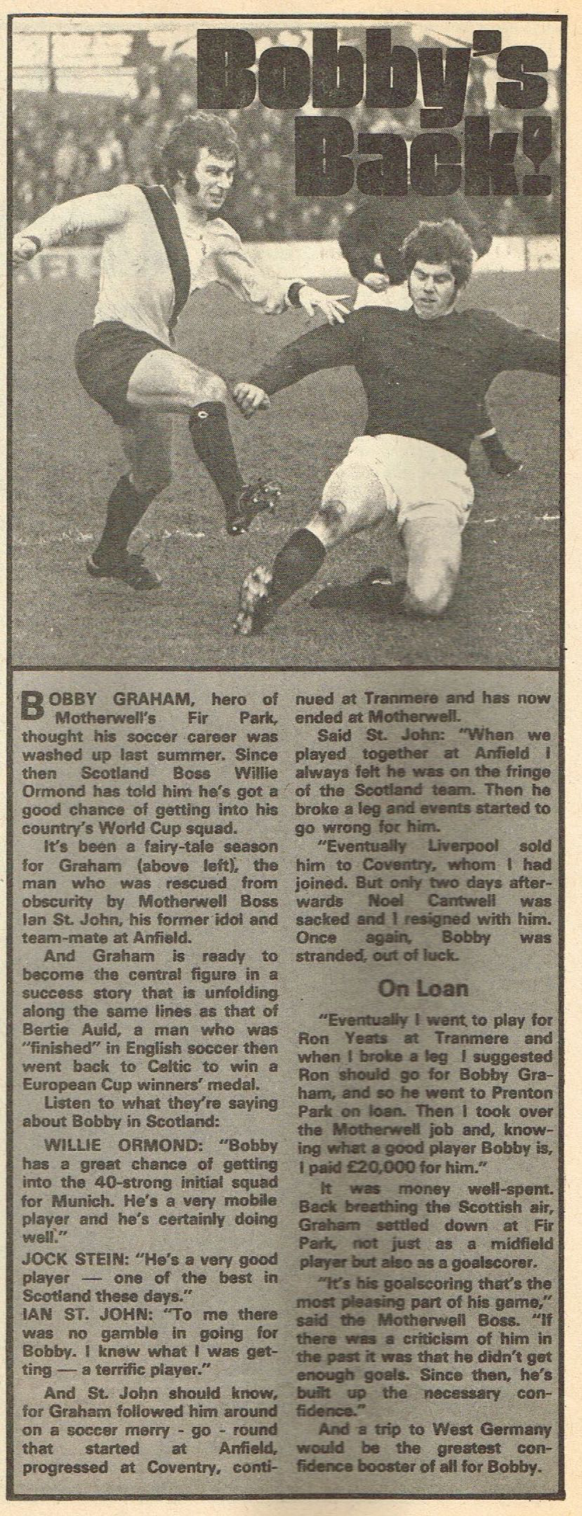
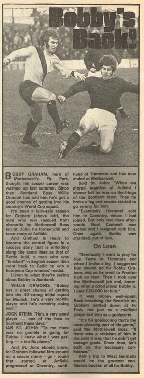
Bobby’s Back!
-
March 1974 - October 1974
-
It would need to be modernised as the large winged ‘Harry Hill’ collar was of the time.
-
I’m hoping for a revival of our 70s Umbro white away for season 21-22. It’s long overdue a reboot. However, I’m sure they will modernise the 70s floppy winged collar to something more ‘now’ from their extensive shirt template archive.

-
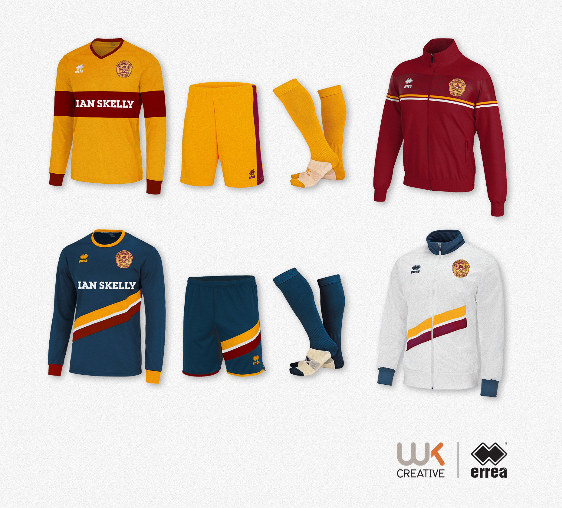
I’ve been experimenting with different team wear providers over the last few months. I enjoy browsing teamwear websites to see what is available, and adapt them to suit Motherwell. I created this pre kit release, but forgot to upload it. The hooped home sleeves and blue away are interesting given what we were eventually provided by Macron. These are two recent templates available on the Errea website. They have a unique take on the traditional sash/band that I’ve not noticed before until recently. An odd placement, however, it does create some free space for the dreaded sponsor logo. I think it was Craig Brown who said, teams/players who wore the same base colour of shirt, shorts and socks looked much taller on the field.

-
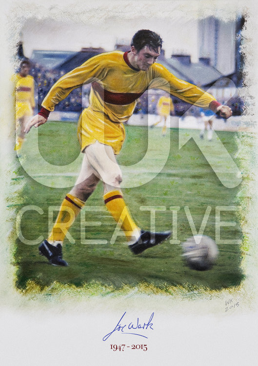
I really enjoy working with mixed media. This is a painting of Motherwell legend Joe Wark I did in 2015. It was initially created in water soluble pastels. However, it has been worked on digitally as well. The final result is a part ‘analogue’ part digital painting. Joe was my football hero as a kid and I was lucky enough to meet him on a few occasions. The signature I used on the drawing was scanned from a card Joe signed for me back in the 1970s. Joe sadly passed away at the age of 67 following a battle with dementia Joe made 539 appearances for Motherwell from 1968 to 1984, under seven different bosses, and dedicated his footballing career to the Fir Park side. After his retirement he became an ambassador for the club. My mixed media painting has lay dormant on my hard drive for nearly 5 years. The plan was to print a small run on fine art paper with all the proceeds going to the Remember Well dementia charity. However, after several failed attempts to get in contact with them I’ve put the project on hold. I think I’ll have another attempt at contacting them as I quite like the painting.
-
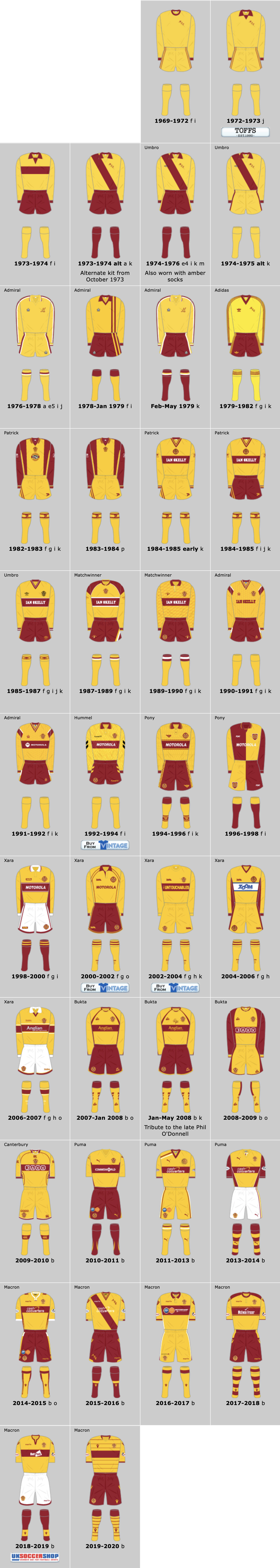
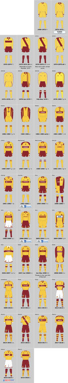
I’m in my 58th year and yes I loved the 70s sash shirts, the other home tops from that era are in the main instantly forgettable design wise. From the cost cutting plain amber to the short lived final 70s Admiral are two low points from that era. Although I still have a soft spot for our first Admiral home. And, the white Admiral away was a design classic. However you said: “in the 50 odd years I've been following MFC I'd guess about half of our kits have had no hoop/band at all.” The historical kit evidence clearly doesn’t back that up, as the majority had a band or hoop. The separate issue is... Should the Motherwell home shirt always have a proper claret hoop? To me there is no debate on that, as our very first shirt in that style had an unbroken hoop. That top set the ground rules which remained intact until season 1969-70. It was only removed due to the hoop stitching repair issues that was mentioned on this forum. The same can be said for the colour. That 1920s shirt was bright amber and set the tone for all subsequent shirts. Sadly the 1970s let the amber slip to yellow, probably due in part to laziness within the club, and the kit providers not giving an arse about our true colour. Luckily we have people in charge now who care about our claret and amber history, and realise we don’t play in maroon and yellow.
-
From 1970 to now we have had 25 shirts with either a band/hoop. And 10 without. The hoop is dominant even during the period you mentioned.
-
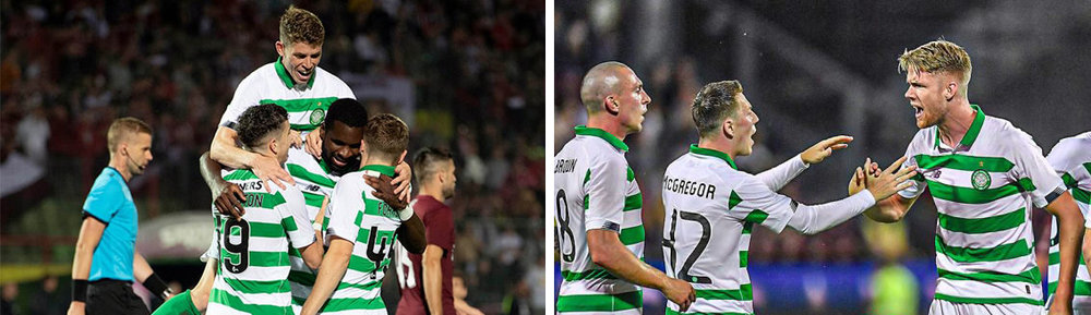
A good example. Celtic in the qualifying rounds (rules relaxed) and Celtic in the ‘proper’ group stage (rules enforced). In the event we reach the ‘proper’ stage our kit would need to be adapted. Up until then we could in theory wear a proper hoop. This is something we have yet to achieve.
-
The SPFL have different kit rules and as it stands they would have no issue with us having a full front/back hoop. Big clubs like Celtic produce special European shirts and probably auction them off after use. Edit: Also worth noting that I don’t think the strict kit rules fully kick in until teams reach the group stages, as UEFA are mindful of the costs involved. Sadly, as yet we have not reached those lofty heights.
-
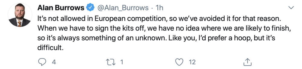
Flow provided an explanation on Twitter and it’s nothing to do with Macron, as they will provide anything we request. It’s just as simple to put a claret band on the back as it is the front. We just need to accept with our current interpretation of the rules the hoop has sadly gone for the foreseeable future.
-
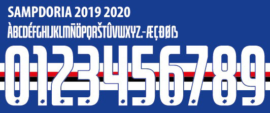
Sampdoria last season. I’m still no ‘clearer’ on the rules.
-
As far as I’m aware they are no different to what they are now. The number issue has been around for a while. I think I’ve been discussing it on the various forums as far back as I can remember.
-
And that’s the point, the rule is very ambiguous. To me that 2015 Sampdoria shirt is far worse than white numbers on the back of a single claret hoop shirt, if UEFA can’t see that they must be blind.
-
Not the best image, however, Sampdoria clearly ‘abiding’ by the Uefa Europa league rules in 2015.

-
I’ve seen a few dodgy ones in recent years that in my opinion have ‘flaunted’ the UEFA rules. So I suspect the word ‘abiding’ is used with a large pinch of salt depending on the team.
-
It’s basically a gamble If you go down the full hoop route as you sadly need to decide your kit so far in advance. Obviously if you don’t qualify for Europe you can within reason do what you want with your shirt, however, sadly crystal balls don’t work that well with kit designs. We are a victim of our own success and have pretty much consigned our hoop to history due to UEFA. However, I’ll be watching Euro/Uefa cup games with interest to see who gets away with these rules.
-
So any truth in the rumours that Paddy Power are on board for another ‘un-sponsored’ shirt season?
-
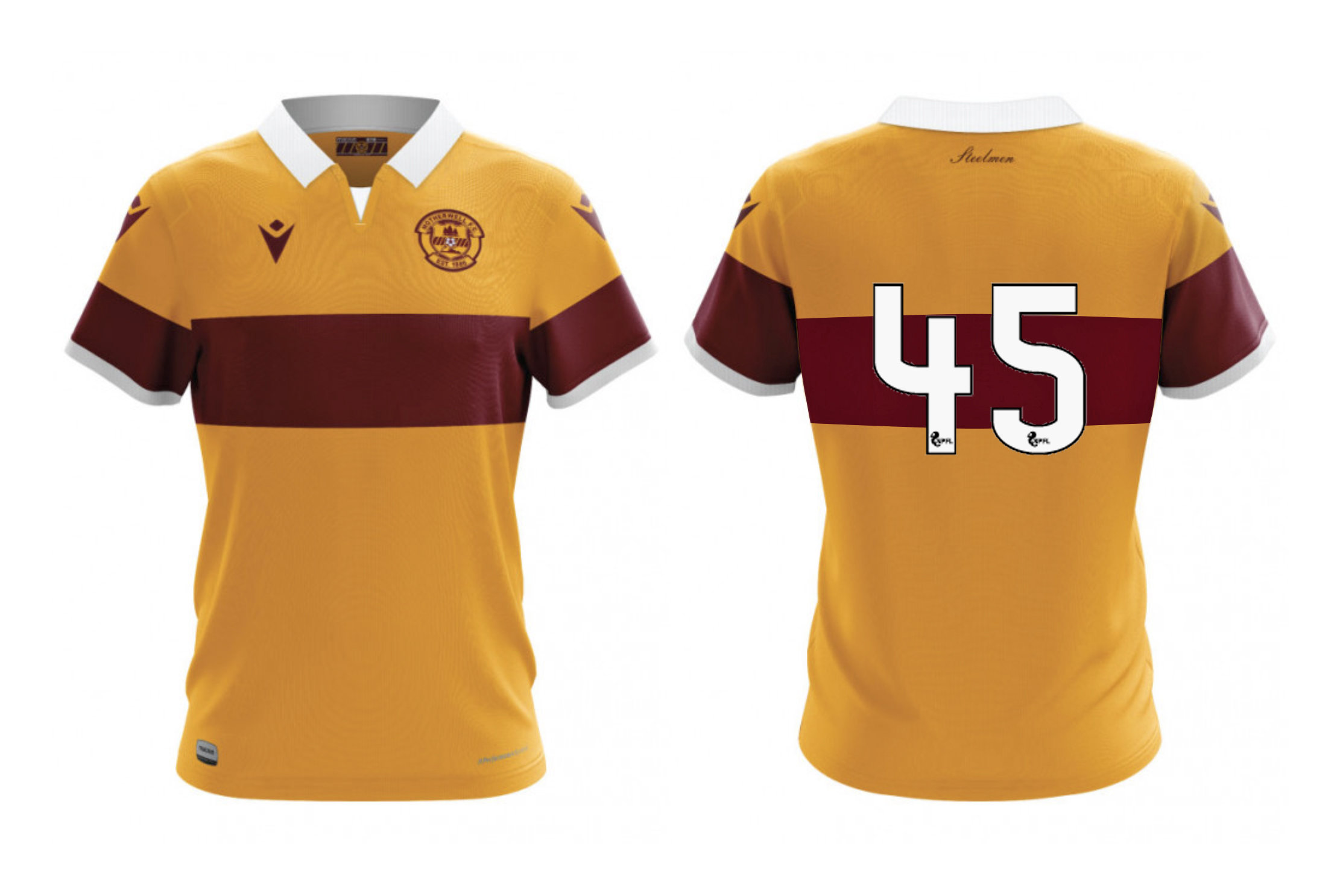
You would need to test the contrast on a Spectrophotometer to be 100% certain the numbers/colours met with UEFA rules. Personally I don’t see an issue with using white numbers, however, Motherwell are playing safe just in case they reach the group stages where the rules would kick in proper. This is my non scientific visual test using the computer generated graphics on the Well Shop page. I’ve added a full hoop and used SPFL numbers. Any UEFA officials in the house?