-
Posts
12,539 -
Joined
-
Last visited
-
Days Won
107
Content Type
Profiles
Forums
Events
Everything posted by underboyleheating
-
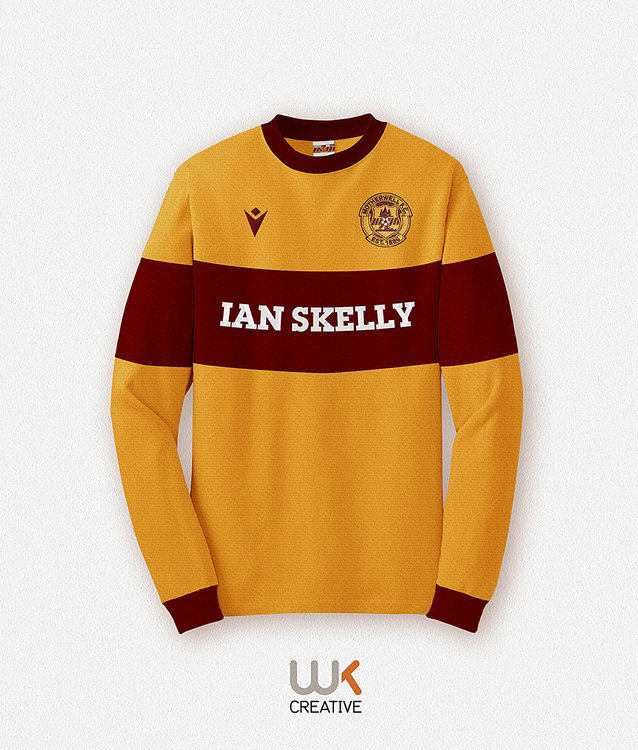
A classic shirt mash up between the popular bold claret hooped sleeve designs of the 20s/30s/40s/50s, and our 1960s signature crew neck shirt. I’m a sucker for the classic Motherwell claret hooped shirt design as it’s instantly recognisable the world over as ‘our shirt’.
-
-
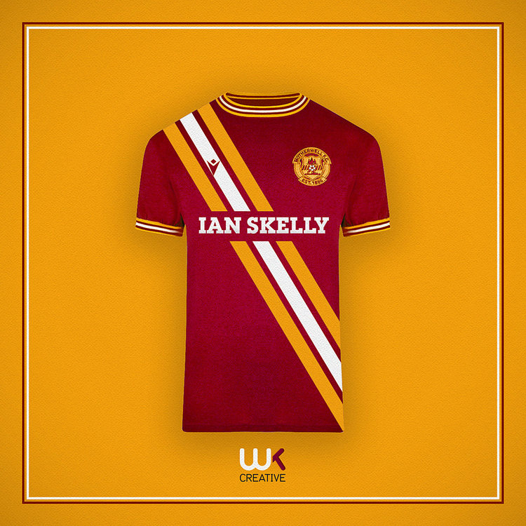
Todays shirt concept has its design roots in the iconic Peru ‘extra wide’ sash shirt. We also had a split claret and amber sash white away in the 70s with a similar collar. A black sash shirt will also evoke memories of ‘Skippy Sunday’ and the day the helicopter turned.
-
Wow, superb. I can’t wait to see the finished model.
-
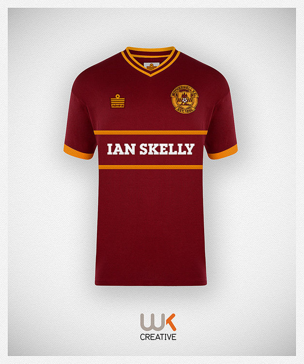
A shirt concept that has roots in the early 2000s when we wore an all claret away shirt with some amber piping. The two bold amber stripes echo the traditional chest hoop/band. I’ve selected Admiral to manufacture this one.
-
Sadly the away will change. I’m expecting perhaps a black or claret kit with flashes of C&A. Or they may even go back to blue.
-
As long as the white sections are dyed amber, I’m fine with that.
-
So next seasons kits will have been decided and no doubt ready to roll. What are you hoping for? Something traditional or perhaps something more radical?
-
I bet the kitman hates white away kits as they must be a nightmare to wash.. However, they look great under the floodlights.
-
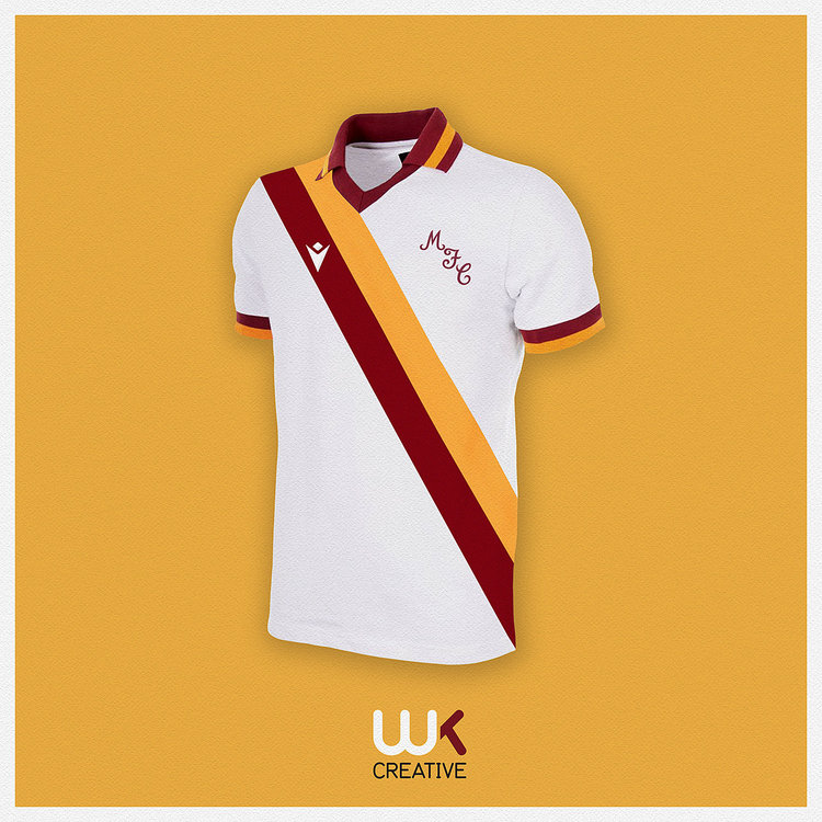
Last one for today. White would be my away colour of choice, but the kit washer wouldn’t thank me. This is a mash up between Roma 80s and Motherwell 70s. I’ve always loved a two tone sash shirt especially in claret & amber.
-
A smaller three striped hoop might work, however, with smaller graphics there is always a danger that it looks more like a tee shirt rather than a football shirt.
-
Here it is. Admiral did a bold stripe sash in the 70s and my original idea was to do a take on that. However, the Macron badge complicates it a bit.
-
First thing that I tried, but I rejected it. I might stick it on here later to see what you think.
-
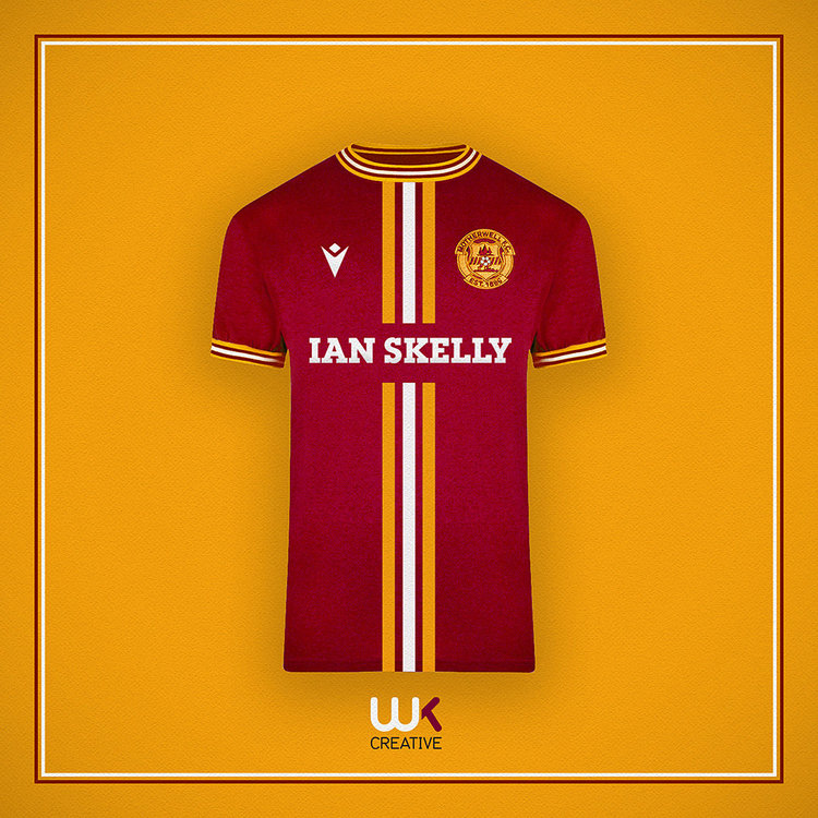
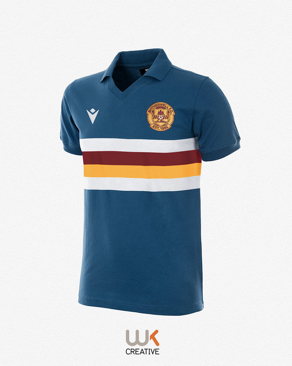
A less traditional design concept from me. An away shirt based around the classic 1960s Fred Perry mod style crewneck collar. Also with a hint of 1970s Admiral on the three bold front stripes.
-
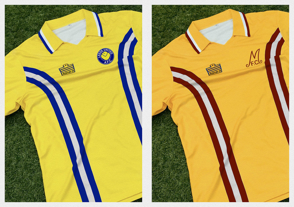
I recently did a fun take on the Admiral tramline shirt to reimagine it in C&A. I also did one for Leeds United fans as we used the same Admiral template as us.
-
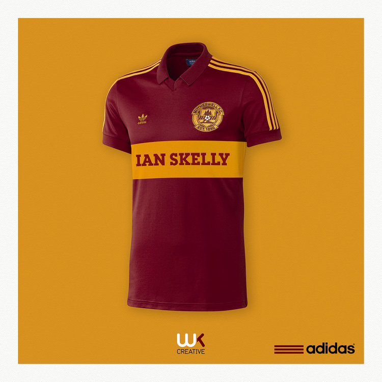
The reverse of our traditional claret hoop/amber shirt has been utilised several times over the years by various manufacturers. Here’s my ‘what if’ adidas had produced it in the 80s. I think it’s probably due a reboot as we last utilised it in 2002.
-
The classic ‘Sampdoria design’ usually adopts hoops of a similar width. However, the width could be easily adapted. I would certainly recommend white shorts/socks with flashes of claret and amber. I would also suggest blue socks as well in case of a white sock clash. Good teams wear classy kits and we would look great in something similar. Worth noting that Macron are great at producing ‘classic retro’ designs.
-
I was a supporter of Motherwell’s 2012-13 ‘petrol blue’ shirt. However, I suspect the shirt that was eventually released was a Puma template that lacked the distinctive 4 bold hooped white/claret/amber/white Sampdoria feel I was pushing for on here at the time. The blue shirt wasn’t to everybody’s taste, although, the colour played an important part in our early kit history. This is another ‘what if’ concept done in a bold hoop Sampdoria style.
-
-
A ‘what if’ Motherwell had continued with adidas into the mid 80s, and stopped using Nottingham Forests, yellow away material as an amber substitute. Oh, and reintroduced our claret hoop. A classic adidas template, given the corporate treatment in photoshop.
-
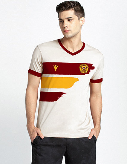
Not a bad idea. Perhaps alternate claret/amber/claret brush strokes on a white base?
-
The father/son had designed loads of different kits, Motherwell just happened to be in there.
-
In the early days Erima made kits for adidas as they didn’t have the facility to produce them. They adidas eventually bought them out, however, they were set free again in the mid 80s I think. Weird how other German companies like Puma, adidas, Hummel have provided kits for clubs in the UK, but Erima haven’t really made inroads. UEFA have had all sorts of issues with kit over the years. I’m sure different sleeve colours were brought up at one point as it could cause confusion during a game. However, if both sleeve colours don’t clash with the opposition I don’t see a problem. UEFA may think different.
-
-
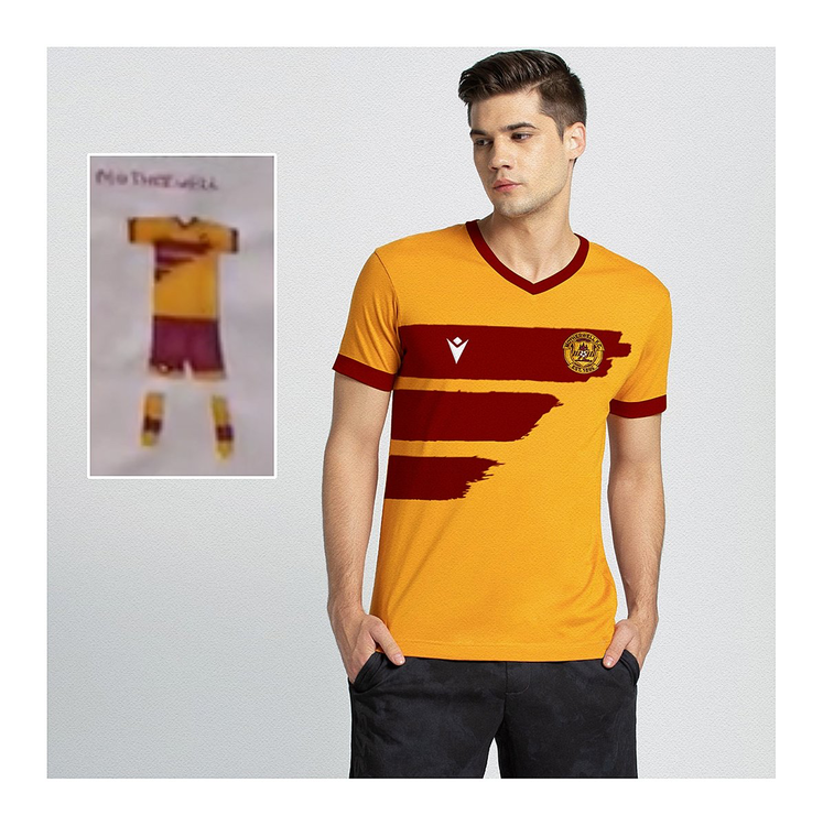
A young boy and his dad have been spending their lockdown time designing football kits. I was so impressed with his son’s Motherwell home shirt I decided to do a very quick mock up to show him what his shirt might look like in the flesh. Looks pretty good to me.


